35.1 - Material Design
Bu dersin tamamını içeren pdf'in link'i :
https://github.com/romainz/CoordinatorLayoutSample buradaki örnekleri kullandım. CoordinatorLayout Samples isiml uygulamayı play store'dan indirerek kodların uygulamayı inceleyebilirsin.

16_CoordinatorExamples_Genel isimli projede şu url'deki projeyi implement ettim : https://github.com/saulmm/CoordinatorExamples :

CoordinatorLayout is very powerful but error-prone at first. If you are running into issues with coordinating behavior, check the following tips below:
- The best example of how to use coordinator layout effectively is to refer carefully to the source code for cheesesquare. This repository is a sample repo kept updated by Google to reflect best practices with coordinating behaviors. In particular, see the layout for a tabbed ViewPager list and this for a layout for a detail view. Compare your code carefully to the cheesesquare source code.
- Make sure that the app:layout_behavior="@string/appbar_scrolling_view_behavior" property is applied to the direct child of the CoordinatorLayout. (app:layout_behavior="@string/appbar_scrolling_view_behavior" attribute'ünü CoordinatorLayout'un direct child'ı olan bir elemen'te yazdığınızdan emin olun. ,İşte bu yüzden CoordinatorLayout içinde bir NestedScrollView onun içindeki bir element'in içine bu attribute'ü yazamayız. )
- When coordinating between a fragment with a list of items inside of a ViewPager and a parent activity, you want to put the app:layout_behavior property on the ViewPager as outlined here so the scrolls within the pager are bubbled up and can be managed by the CoordinatorLayout. Note that you should not put that app:layout_behavior property anywhere within the fragment or the list within.
- Keep in mind that ScrollView does not work with CoordinatorLayout. You will need to use the NestedScrollViewinstead as shown in this example. Wrapping your content in the NestedScrollView and applying the app:layout_behavior property will cause the scrolling behavior to work as expected. ( ScrollView CoordinatorLayout ile birlikte düzgün çalışmaz dolayısıyla CoordinatorLayout element içerisinde NestedScrollView yazabiliriz ama ScrollView yazamayız. )
- Make sure that the root layout of your activity or fragment is a CoordinatorLayout. Scrolls will not react to any of the other layouts. ( Activity veya fragment'ınızın layout'unun root'unun CoordinatorLayout olduğundan emin olun. Aksi takdirde yukarıda anlattığımız scroll event'ler ve daha bir çok özellik düzgün çalışmayacaktır. )
15.1 - Tab Navigation by using Android Design Support Library - TabLayout, ViewPager, PagerAdapter
Action bar also provides tabbed navigation. This way is suggested when the navigation is too frequent between views. ( Action bar'a ekleyebileceğimiz bir diğer özellik tabbed navigation'dır. View'ler arasında geçiş çok sık ise tabbed navigation kullanmak mantıklıdır. )
https://developer.android.com/training/implementing-navigation/lateral.html#PagerTitleStrip
Swipe views provide lateral navigation between sibling screens such as tabs with a horizontal finger gesture (a pattern sometimes known as horizontal paging). ( Swip view'ler bize kardeş viewler arasında mesela tab'lar arasında parmak kaydırarak geçiş yapmayı sağlar. )
Implement Swipe Views
You can create swipe views in your app using the ViewPager widget, available in the Support Library. The ViewPager is a layout widget in which each child view is a separate page (a separate tab) in the layout. ( Uygulamamızda swipe view'ler yaratmak için Support Library'deki ViewPager widget'i kullanabiliriz. ViewPager, layout xml dosyasındaki bir eleman'dır. ViewPager bir ViewGroup'dur, içerdiği view'ler ise layout'daki farklı sayfalardır veya layout'daki farklı tab'lardır. Yani swipe view'de gördüğümüz herbir tab, ViewPager'ın içerdiği bir child'dır. )
To set up your layout with ViewPager, add a <ViewPager> element to your XML layout. For example, if each page in the swipe view should consume the entire layout, then your layout looks like this: ( Layout xml dosyasına ViewPager element yazılır. Örneğin swipe view'deki tab'lar tüm sayfayı kaplayacaksa, layout xml dosyasında ViewPager element'i aşağıdaki gibi yazarız. )
<?xml version="1.0" encoding="utf-8"?>
<android.support.v4.view.ViewPager
xmlns:android="http://schemas.android.com/apk/res/android"
android:id="@+id/pager"
android:layout_width="match_parent"
android:layout_height="match_parent" />
<android.support.v4.view.ViewPager
xmlns:android="http://schemas.android.com/apk/res/android"
android:id="@+id/pager"
android:layout_width="match_parent"
android:layout_height="match_parent" />
MainActivity class'ının onCreate() method'unda bu view'i kullanarak bir ViewPager object elde ederiz.
final ViewPager viewPager = (ViewPager) findViewById(R.id.pager);
To insert child views that represent each page, you need to hook this layout to a PagerAdapter. There are two kinds of adapter you can use: ( ViewPager object'e child view eklemek için PagerAdapter kullanmalıyız. ViewPager object'e ekleyeceğimiz child view'ler tab'lara veya sayfalar karşılık gelir. Yani ViewPager'a tab'ları temsil eden child view'ler ekleriz. Bu child view'leri eklemek için PagerAdapter kullanırız. 2 çeşit PagerAdapter vardır. )
This is best when navigating between sibling screens representing a fixed, small number of pages. ( Az ve sabit sayıda tab varsa, FragmentPagerAdapter class'ını kullanırız. Örneğin 3 tane tab var diyelim, bu 3 tab'In içerdiği FragmentPagerAdapter object'ler memory'de tutulurlar yok edilmezler. )
This is best for paging across a collection of objects for which the number of pages is undetermined. It destroys fragments as the user navigates to other pages, minimizing memory usage. ( ViewPager'daki child sayısı(tab sayısı) belli değilse, diğer bir deyişle object'ler içeren bir collection üzerinde gezeceksek FragmentStatePagerAdapter class'ını kullanırız. Kullanıcının gördüğü bir tab'ın içeriği fargment'dır. Kullanıcı tab'lar arasında gezerken, kullanıcının bakmadığı tab'lar yok edilir, memory'den silinir. )
TabLayout provides a horizontal layout to display tabs. ( TabLayout, Tab kutucuklarını gösteren bir yatay layout gösterir. )
Population of the tabs to display is done through TabLayout.Tab instances. You create tabs via newTab(). From there you can change the tab's label or icon via setText(int) and setIcon(int) respectively. To display the tab, you need to add it to the layout via one of the addTab(Tab) methods. For example: ( TabLayout'da gösterilecek olan şeyler, TabLayout class'ının içerdiği Tab inner class'ı kullanılarak ayarlanır. TabLayout class'ının newTab() method'unu çağırarak inner class olan Tab class'ından bir object yaratmış oluruz. Yani Tab layout'da gösterilecek bir kutu yaratmış oluruz. Tab object'in setText() ve setIcon() method'larını çağırarak tab kutucuğunda gösterilecek yazıyı ve icon'u set edebiliriz. TabLayout'un addTab() method'unu çağırarak, tab object'leri TabLayout'a aşağıdaki gibi ekleriz. )
TabLayout tabLayout = ...;
tabLayout.addTab(tabLayout.newTab().setText("Tab 1"));
tabLayout.addTab(tabLayout.newTab().setText("Tab 2"));
tabLayout.addTab(tabLayout.newTab().setText("Tab 3"));
tabLayout.addTab(tabLayout.newTab().setText("Tab 1"));
tabLayout.addTab(tabLayout.newTab().setText("Tab 2"));
tabLayout.addTab(tabLayout.newTab().setText("Tab 3"));
You should set a listener via addOnTabSelectedListener(OnTabSelectedListener) to be notified when any tab's selection state has been changed. ( Sonra TabLayout object'in addOnTabSelectedListener() method'unu çağırarak TabLayout'a bir listener register ederiz. Bir tab seçildiğinde otomatik olarak bu method çağırılır. )
You can also add items to TabLayout in your layout through the use of TabItem. An example usage is like so: ( TabLayout'a TabLayout object'in addTab() method'unu çağırarak Tab ekleyebileceğimiz öğrendik yukarıda. Bunun yerine, layout xml dosyasında TabLayout element içerisinde TabItem element tanımlayarak da TabLayout'a tab ekleyebiliriz. )
<android.support.design.widget.TabLayout
android:layout_height="wrap_content"
android:layout_width="match_parent">
<android.support.design.widget.TabItem
android:text="@string/tab_text"/>
<android.support.design.widget.TabItem
android:icon="@drawable/ic_android"/>
</android.support.design.widget.TabLayout>
android:layout_height="wrap_content"
android:layout_width="match_parent">
<android.support.design.widget.TabItem
android:text="@string/tab_text"/>
<android.support.design.widget.TabItem
android:icon="@drawable/ic_android"/>
</android.support.design.widget.TabLayout>
Types of Tabs:
2 çeşit Tab vardır:
- Fixed Tabs
- Scrollable Tabs
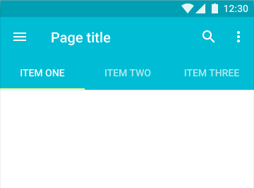
Fixed tab'lar şöyle gözükür :
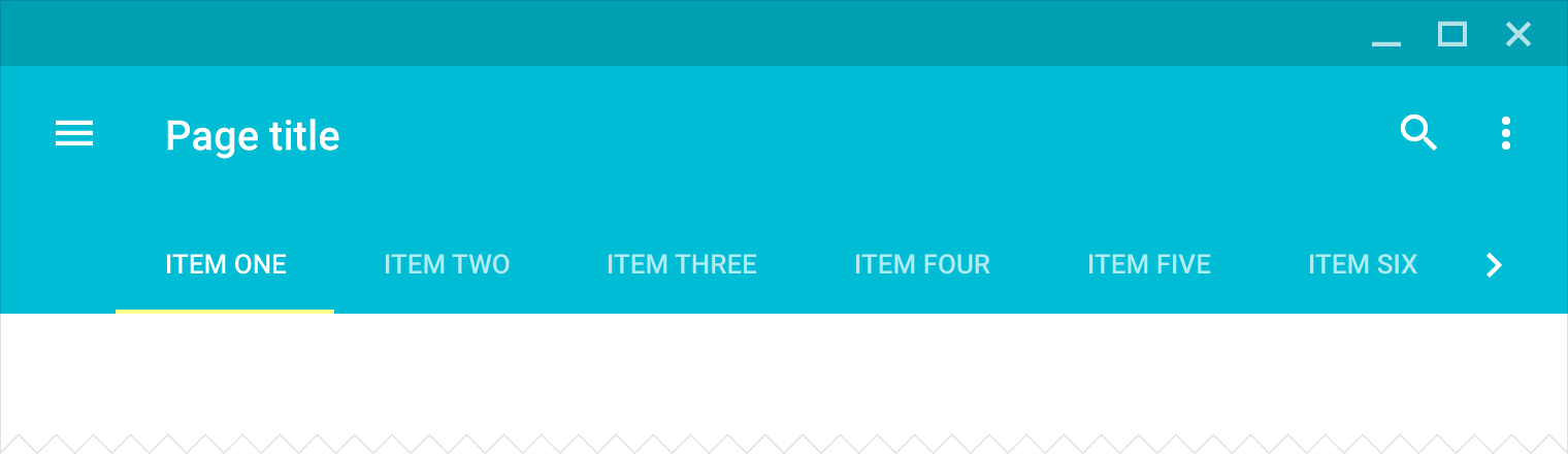
Scrollable Tab'lar şöyle gözükür :


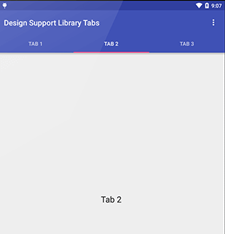
Tab type navigation mode is a very common design pattern among android apps. But since Android’s 5.0 release, material design came in to picture and allot of changes were made in various APIs. Resulting the deprecation of action bar. Although a new API, Android Toolbar was released to replace it. Due to this change, new APIs for android tabs were also released through the design support library recently. The main class used for displaying tabs through these new APIs is Android TabLayout. In this Android Tab example we would make a screen with three tabs using these new APIs for tabs with Fragments and a ViewPager which would look like the image below: ( Action bar ile birlikte Navigation mode olarak tab kullanmak çok yaygındır. Whatsapp, PlayStore, Facebook ve daha çok uygulama bunu kullanır. Android 5.0 ile birlikte material design ortaya çıktı ve birçok API'da değişiklikler oldu. Action bar eski moda oldu, onun yerine toolbar kullanılmaya başlandı. Bu değişiklikten dolayı tab implement etmek için de support library ile birlikte yeni API yayınlandı. Yeni API'da tab göstermek için TabLayout isimli bir class kullanılmaktadır. Bu örnekte, yeni API'ı Fragment'larla ve ViewPager ile birlikte kullanarak ekranda 3 tane tab göstereceğiz. Output aşağıdaki gibi gözükecektir : )
Full source (16_MaterialDesign_Tabs)
http://www.truiton.com/2015/06/android-tabs-example-fragments-viewpager/
Projeyi çalıştırabilmek için önce şu dependency'leri build.gradle dosyasına eklemeliyiz. Sonra synchronize'a tıkla:
compile 'com.android.support:appcompat-v7:22.2.0'
compile 'com.android.support:design:22.2.0'
Now since we will be using Android Toolbar and TabLayout classes to show tabs, lets remove the action bar from layout by using styles: (Tab'ları göstermek için Toolbar ve TabLayout class'larını kullanacağımız için eski usul action bar'ı layout'dan styles kullanarak sileriz. )
styles.xml
<resources>
<!-- Base application theme. -->
<style name="AppTheme" parent="Theme.AppCompat.Light.NoActionBar">
<!-- your app branding color for the app bar -->
<item name="colorPrimary">#3F51B5</item>
<!-- darker variant for the status bar and contextual app bars -->
<item name="colorPrimaryDark">#303F9F</item>
<!-- theme UI controls like checkboxes and text fields -->
<item name="colorAccent">#FF4081</item>
</style>
</resources>
Next, to display Android tabs with fragment and ViewPager, lets define three simple fragments and their layouts: ( Fragment ve ViewPager kullanarak Android tab göstermek için önce 3 tane basit fragment class'ı ve layout'u tanımlayalım : )
TabFragment1.xml
public class TabFragment1 extends Fragment {
@Override
public View onCreateView(LayoutInflater inflater, ViewGroup container, Bundle savedInstanceState) {
return inflater.inflate(R.layout.tab_fragment_1, container, false);
}
}
tab_fragment_1.xml
<?xml version="1.0" encoding="utf-8"?>
<RelativeLayout xmlns:android="http://schemas.android.com/apk/res/android"
android:layout_width="match_parent"
android:layout_height="match_parent"
android:orientation="vertical">
<TextView
android:id="@+id/textView"
android:layout_width="wrap_content"
android:layout_height="wrap_content"
android:layout_centerInParent="true"
android:text="Tab 1"
android:textAppearance="?android:attr/textAppearanceLarge"/>
</RelativeLayout>
Yukarıdaki aynı kodları kullanarak TabFragment2.java, TabFragment3.java, tab_fragment_2.xml ve tab_fragment_3.xml dosyalarını yazarız.
3 tab'da kullanacağımız 3 fragment'ı da tanımladık. Şimdi ise tab'lar arasında elle kaydırarak geçiş yapma özeliiğinin olması için yani swipe tabs özelliği için, view pager adapter tanımlayalım. FragmentStatePagerAdapter class'ını extend eden bir class tanımlarız. Bu class'da tab sayısını tutan bir int variable tanımlarız. Bu class'da getItem(int) method'unu override ederiz, switch case kullanırız, case 0 ilk tab'dır, case 1 ikinci tab'dır, case 2 üçüncü tab'dır, tanımladığımız fragment class'larından object'ler yaratıp bu object'leri return ederiz. Ayrıca bu class'da getCount() method'unu override ederiz, tab sayısını return eder bu method. Bu class'ın constructor'ı 2 argument alır : FragmentManager object ve tab sayısı.
PagerAdapter.java
import android.support.v4.app.Fragment;
import android.support.v4.app.FragmentManager;
import android.support.v4.app.FragmentStatePagerAdapter;
public class PagerAdapter extends FragmentStatePagerAdapter {
int mNumOfTabs;
public PagerAdapter(FragmentManager fm, int NumOfTabs) {
super(fm);
this.mNumOfTabs = NumOfTabs;
}
@Override
public Fragment getItem(int position) {
switch (position) {
case 0:
TabFragment1 tab1 = new TabFragment1();
return tab1;
case 1:
TabFragment2 tab2 = new TabFragment2();
return tab2;
case 2:
TabFragment3 tab3 = new TabFragment3();
return tab3;
default:
return null;
}
}
@Override
public int getCount() {
return mNumOfTabs;
}
}
In the view state pager adapter above, you may see that I have just initialized the fragments as per their location. Next lets define the layout for main activity where all these tabs would be displayed. ( Yukarıda FragmentStatePagerAdapter class'ını extend eden bir class tanımladık. Bu class'ın getItem() method'unda, 3 farklı Fragment class'dan object yaratırız ve switch case'lerde bu object'leri return ederiz. Sonra main activity layout dosyasını aşağıdaki gibi hazırlarız. main activity'nin layout'unda tüm bu tab'lar gösterilecektir. Bu örnekte FragmentStatePagerAdapter class'ını extend eden bir class tanımladık ancak doğrusu FragmentPagerAdapter class'ını extend etmek daha doğrudur bence çünkü tab sayısı sabittir. )
Swipe view'ler oluşturmak için ViewPager kullanılması gerektiğini daha önce söylemiştik. ViewPager bir ViewGroup'dur, bu viewgroup'Un içerdiği child'lar da tab'lardır. ViewPager tab'Ların içeriğini gösterir, TabLayout element ise Tab kutucuklarını gösterir gibi düşün.
activity_main.xml
<?xml version="1.0" encoding="utf-8"?>
<RelativeLayout
android:id="@+id/main_layout"
xmlns:android="http://schemas.android.com/apk/res/android"
xmlns:app="http://schemas.android.com/apk/res-auto"
xmlns:tools="http://schemas.android.com/tools"
android:layout_width="match_parent"
android:layout_height="match_parent"
tools:context=".MainActivity">
<android.support.v7.widget.Toolbar
android:id="@+id/toolbar"
android:layout_width="match_parent"
android:layout_height="wrap_content"
android:layout_alignParentTop="true"
android:background="?attr/colorPrimary"
android:elevation="6dp"
android:minHeight="?attr/actionBarSize" android:theme="@style/ThemeOverlay.AppCompat.Dark.ActionBar"
app:popupTheme="@style/ThemeOverlay.AppCompat.Light"/>
<android.support.design.widget.TabLayout
android:id="@+id/tab_layout"
android:layout_width="match_parent"
android:layout_height="wrap_content"
android:layout_below="@+id/toolbar"
android:background="?attr/colorPrimary"
android:elevation="6dp"
android:minHeight="?attr/actionBarSize"
android:theme="@style/ThemeOverlay.AppCompat.Dark.ActionBar"/>
<android.support.v4.view.ViewPager
android:id="@+id/pager"
android:layout_width="match_parent"
android:layout_height="fill_parent"
android:layout_below="@id/tab_layout"/>
</RelativeLayout>
MainActivity'de, layout xml'de tanımladığımız TabLayout object'i elde ederiz. Sonra TabLayout object'İn addTab() method'Larını çağırarak Tab kutucuklarını oluştururuz. Sonra setTabGravity() method'unu çağırarak tab'ların ekranın tamamını kaplamasını sağlarız bunu layout dosyasında tabGravity attribute'ünü kullanarak da yapabilirdik (If you want the tabs to be occupied the fullwidth of the screen, you need to assign app:tabGravity=”fill” to our TabLayout. )
Sonra layout xml'de tanımladığımız ViewPager element'i kullanarak ViewPager object elde ederiz:
final ViewPager viewPager = (ViewPager) findViewById(R.id.pager);
Sonra yukarıda tanımladığımız PagerAdapter class'ından bir object yaratırız, PagerAdapter'ün constructor'ına FragmentManager object ve tab sayısını paremetre olarak vererek:
final PagerAdapter adapter = new PagerAdapter
(getSupportFragmentManager(), tabLayout.getTabCount());
Sonra viewPager object'in setAdapter() method'unu çağırarak, viewPager object ve PagerAdapter object'i birbirine bağlarız:
(getSupportFragmentManager(), tabLayout.getTabCount());
Sonra viewPager object'in setAdapter() method'unu çağırarak, viewPager object ve PagerAdapter object'i birbirine bağlarız:
viewPager.setAdapter(adapter);
Sonra viewPager object'in addOnPageChangeListener() method'unu çağırırız, argument olarak TabLayout class'ındaki TabLayoutOnPageChangeListener inner class'ının constructor'ına tabLayout object verilir. Böylece, sayfalar arasında geçiş yapılınca bu method çağırılır. viewPager.addOnPageChangeListener(new TabLayout.TabLayoutOnPageChangeListener(tabLayout));
tablayout object'in addOnTabSelectedListener() method'u çağırılarak sayfalar arasında geçiş yapılıra çağırılacak olan şey set edilir:
tabLayout.addOnTabSelectedListener(new TabLayout.OnTabSelectedListener() {
@Override
public void onTabSelected(TabLayout.Tab tab) {
viewPager.setCurrentItem(tab.getPosition());
}
@Override
public void onTabUnselected(TabLayout.Tab tab) {
}
@Override
public void onTabReselected(TabLayout.Tab tab) {
}
});
}
@Override
public void onTabSelected(TabLayout.Tab tab) {
viewPager.setCurrentItem(tab.getPosition());
}
@Override
public void onTabUnselected(TabLayout.Tab tab) {
}
@Override
public void onTabReselected(TabLayout.Tab tab) {
}
});
}
MainActivity.java
import android.support.design.widget.TabLayout;
import android.support.v4.view.ViewPager;
import android.support.v7.app.AppCompatActivity;
import android.support.v7.widget.Toolbar;
import android.view.Menu;
import android.view.MenuItem;
public class MainActivity extends AppCompatActivity {
@Override
protected void onCreate(Bundle savedInstanceState) {
super.onCreate(savedInstanceState);
setContentView(R.layout.activity_main);
Toolbar toolbar = (Toolbar) findViewById(R.id.toolbar);
setSupportActionBar(toolbar);
TabLayout tabLayout = (TabLayout) findViewById(R.id.tab_layout);
tabLayout.addTab(tabLayout.newTab().setText("Tab 1"));
tabLayout.addTab(tabLayout.newTab().setText("Tab 2"));
tabLayout.addTab(tabLayout.newTab().setText("Tab 3"));
tabLayout.setTabGravity(TabLayout.GRAVITY_FILL);
final ViewPager viewPager = (ViewPager) findViewById(R.id.pager);
final PagerAdapter adapter = new PagerAdapter
(getSupportFragmentManager(), tabLayout.getTabCount());
viewPager.setAdapter(adapter);
viewPager.addOnPageChangeListener(new TabLayout.TabLayoutOnPageChangeListener(tabLayout));
tabLayout.addOnTabSelectedListener(new TabLayout.OnTabSelectedListener() {
@Override
public void onTabSelected(TabLayout.Tab tab) {
viewPager.setCurrentItem(tab.getPosition());
}
@Override
public void onTabUnselected(TabLayout.Tab tab) {
}
@Override
public void onTabReselected(TabLayout.Tab tab) {
}
});
}
@Override
public boolean onCreateOptionsMenu(Menu menu) {
getMenuInflater().inflate(R.menu.main, menu);
return true;
}
@Override
public boolean onOptionsItemSelected(MenuItem item) {
int id = item.getItemId();
if (id == R.id.action_settings) {
return true;
}
return super.onOptionsItemSelected(item);
}
}
15_ActionBar_2_TabNavigation isimli projeye aittir yukarıdaki kodlar.
Output :

Yukarıdaki kodda eski kod kullandık, bunun yerine daha yeni kod kullanabiliriz, viewpager ile tablayout'u birbirine setupWithPageViewer() method'Unu çağırarak bağlayabilriz.
The Android team has changed a few things about how TabLayout and ViewPager talk to each other:
tabLayout.setupWithViewPager(viewPager);
This way you don't need to worry about setting the fragment yourself when a tab is selected. tabLayout.setOnTabSelectedListener(..) is no longer needed in this situation. That is handled under the hood. This is useful when you don't need too much control over your tabs(like reloading fragment when same tab is selected/tapped).
MainActivity :
Şunu silip :
TabLayout tabLayout = (TabLayout) findViewById(R.id.tab_layout);
tabLayout.addTab(tabLayout.newTab().setText("Tab 1"));
tabLayout.addTab(tabLayout.newTab().setText("Tab 2"));
tabLayout.addTab(tabLayout.newTab().setText("Tab 3"));
tabLayout.setTabGravity(TabLayout.GRAVITY_FILL);
tabLayout.addTab(tabLayout.newTab().setText("Tab 1"));
tabLayout.addTab(tabLayout.newTab().setText("Tab 2"));
tabLayout.addTab(tabLayout.newTab().setText("Tab 3"));
tabLayout.setTabGravity(TabLayout.GRAVITY_FILL);
bunun yerine sadece şunu yazarız :
TabLayout tabLayout = (TabLayout) findViewById(R.id.tab_layout);
TabLayout ile ViewPager'ı birbirine şöyle bağlarız :
final ViewPager viewPager = (ViewPager) findViewById(R.id.pager);
TabLayout tabLayout = (TabLayout) findViewById(R.id.tab_layout);
tabLayout.setupWithViewPager(viewPager);
TabLayout tabLayout = (TabLayout) findViewById(R.id.tab_layout);
tabLayout.setupWithViewPager(viewPager);
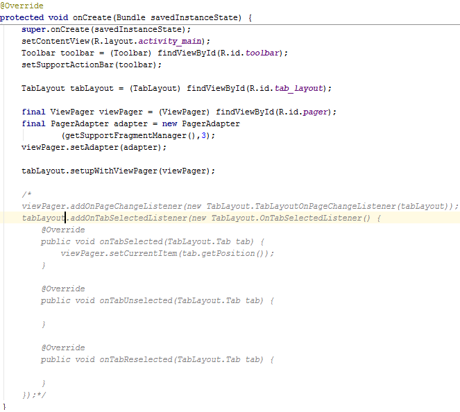
MainActivity'de aşağıdaki kısma artık gerek yoktur, bu kısmı comment'leriz artık:
/*
viewPager.addOnPageChangeListener(new TabLayout.TabLayoutOnPageChangeListener(tabLayout));
tabLayout.addOnTabSelectedListener(new TabLayout.OnTabSelectedListener() {
@Override
public void onTabSelected(TabLayout.Tab tab) {
viewPager.setCurrentItem(tab.getPosition());
}
@Override
public void onTabUnselected(TabLayout.Tab tab) {
}
@Override
public void onTabReselected(TabLayout.Tab tab) {
}
});*/
MainActivity'nin onCreate() method'u artık şöyledir :
PagerAdapter:
getItem() method'unda viewpager'da yani bir tab seçilince hangi fragment'ın seçileceğini belirtiriz. getPageTitle() method'unu ise Tab'ların title'larını belirlemek için tanımlarız. getCount() method'u ise tab sayısını return eder.Bu class'da bir ArrayList tanımlarız, bu arrayList tab'ların title'larını tutar. getPageTitle() method'unda bu arraylist'i kullanırız.
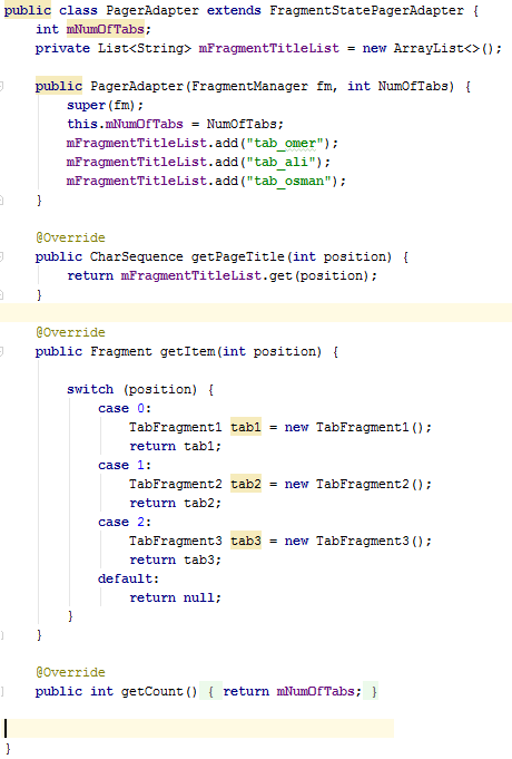
MainActivity kodunu setupWithViewPager() method'unu çağıracak şekilde değiştirdikten sonra, PagerAdapter class'ını da güncelleriz aşağıdaki gibi, bu class'da mFragmentTitleList isimli bir ArrayList tanımlarız, bu listeye 3 tane String ekleriz. Bu String'ler Tab'ların title'ları olacaktır, işte bunu yapmak için de getPageTitle() method'unu override ederiz, arraylist'in 0.pozisyonundaki string 1. tab'ın title'ı olacaktır örneğin.
public class PagerAdapter extends FragmentStatePagerAdapter {
int mNumOfTabs;
private List<String> mFragmentTitleList = new ArrayList<>();
public PagerAdapter(FragmentManager fm, int NumOfTabs) {
super(fm);
this.mNumOfTabs = NumOfTabs;
mFragmentTitleList.add("tab_omer");
mFragmentTitleList.add("tab_ali");
mFragmentTitleList.add("tab_osman");
}
@Override
public CharSequence getPageTitle(int position) {
return mFragmentTitleList.get(position);
}
}
Ayrıca hangi tab'da hangi fragment'ın görüneceğini ise getItem() method'unda tanımlarız. Bu örnekteki gibi fragment object'leri FragmentStatePagerAdapter class'ında yaratmak yerine MainActivity class'ında yaratıp, FragmentStatePagerAdapter class'ının constructor'ına bu object'i veririz. FragmentStatePagerAdapter class'ında bir Fragment object'leri tutan bir ArrayList tanımlayabiliriz, getItem() method'u ise bu ArrayList'in ilgili pozisyonundaki fragment'ı return eder. Buna benzer bir örneği bir sonraki örnekte yapacağız.
The AppBarLayout is used to achieve various scrolling behaviors such as collapse, flex space, and quick return. ( AppBarLayout view object, çeşitli scrolling davranışlarını başarmak için kullanılır, örneğin collapse, flex space, ve quick return gibi scrolling davranışlarını gerçekleştirmek için AppBarLayout view object kullanılır. )
If you want just to include the Toolbar without any scrolling effects you can use Toolbar. But if you want to make some scrolling effects like on the images you need to use AppBarLayout. ( Eğer scrolling efekleri olmayan sade bir appbar(toolbar) kullanmak istiyorsak Toolbar view object kullanırız. Eğer scrolling efekleri olan bir appbar(toolbar) kullanmak istiyorsak AppBarLayout view object kullanmalıyız. )

AppBarLayout is a vertical LinearLayout . ( AppBarLayout, vertical orientation'a sahip olan bir LinearLayout'dur. )
Children should provide their desired scrolling behavior through setScrollFlags(int) and the associated layout xml attribute: app:layout_scrollFlags. ( AppBarLayout view object'in child view object'leri için scrolling davranışı sağlamak için setScrollFlags(int) method'u çağırılır veya layout xml'de app:layout_scrollFlags attribute'ü kullanılır. )
This view depends heavily on being used as a direct child within a CoordinatorLayout. If you use AppBarLayout within a different ViewGroup, most of it's functionality will not work. ( AppBarLayout element'in düzgün bir şekilde çalışabilmesi için, AppBarLayout element'in doğrudan CoordinatorLayout element içerisinde tanımlanmış olması zorunludur. )
Scrolling techniques affect how content scrolls in relation to the app bar. ( Scrolling teknikleri, content'in appbar'a göre nasıl scroll edeceğini etkiler. )
App bar scrollable regions
https://material.io/guidelines/patterns/scrolling-techniques.html#
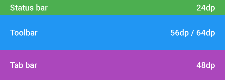
When designing scrolling behavior, app bars contain four main regions (referred to as blocks) that comprise the scrolling structure: ( Bir appbar((action bar) 4 tane alan(block) içerir. )
- Status bar ( saat'in gösterildiği alan )
- Tool bar ( action bar, diğer adıyla navigation bar. search bar da bu kısımda diyebiliyorum neden tab bar ile aynı alanda denilmiş resmi dökümanda bilmiyorum. )
- Tab bar/search bar ( tab title'ları bu alanda gösterilir. )
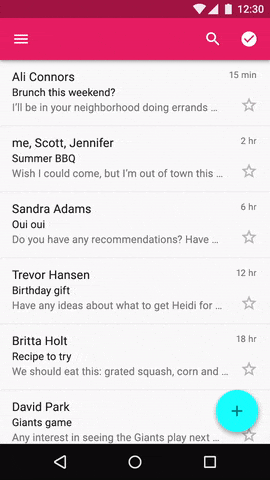
- Flexible space: space to accommodate a desired aspect ratio for images or extended app bars. ( Bu alanda bir resim gösterebiliriz, scroll edince bu alan kaybolur/yeniden gösterilir. )

App bar components can include: status bar, navigation bar, tab/search bar, and flexible space.

Example of a status bar, navigation bar, tab/search bar, and flexible space
App bar'ın behaviour'ı
The standard app bar height is 56dp on mobile and 64dp on larger screen sizes.
The app bar has two scrolling options: ( AppBarLayout'un 2 farklı behaviour'ı yani 2 farklı scrolling seçeneği vardır. )
- The app bar can scroll off-screen with the content and return when the user reverse scrolls. ( Ekranı aşağıda doğru kaydırdığımızda(aşağı scroll ettiğimizde) appbar kaybolur, sonra yukarı scroll edersek appbar tekrar gösterilir. )
- The app bar can stay fixed at the top with content scrolling under it. ( Ekranı aşağı ve yukarı kaydırınca appbar kaybolmaz, appbar daima sabittir. )

The standard bir app bar'daki status bar ve toolbar'ın yükseklikleri aşağıdaki gibidir:
Status bar height: 24dp
Toolbar height: 56dp / 64dp
Toolbar height: 56dp / 64dp
Başlangıçta soldaki gibi görünen appbar, aşağı scroll edince sağdaki gibi kaybolur. Tekrar yukarı scroll edersek soldaki gibi appbar tekrar gözükür.


Animation of toolbar off-screen during scrolling ( Appbar'ın davranışı scroll off-screen olduğunda yukarıdaki gibi olur. )
App bar with tabs
The standard app bar component that can include the following blocks: a toolbar, tab bar, or flexible space. ( AppBar(action bar)'ı öğrenmiştik. Bir appbar(action bar), şunları içerebilir :
- toolbar,
- tab bar,
- flexible space(genellikle bir resim koyulur bu alana). )
Tabs may have one of these behaviors: ( Appbar'daki tab'lar şu davranışlara sahip olabilirler. )
- The tab bar stays anchored at the top, while the toolbar scrolls off. (Appbar(toolbar) kaybolur ama tab bar daima gösterilir. Diğer bir deyişle, yukarı da scroll etsek aşağı da scroll etsek tab bar üstte sabit durur. Ancak aşağı scroll edersek toolbar kaybolur, yukarı scroll edince toolbar tekrar gösterilir.)
- The app bar stays anchored at the top, with the content scrolling underneath. ( Appbar ve tab bar daima gösterilir. )
- Both the toolbar and tab bar scroll off with content. The tab bar returns on reverse-scroll, and the toolbar returns on complete reverse scroll. ( Scroll ettikçe appbar ve tab bar kaybolur ve tekrar gösterilir. )
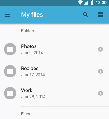
Aşağıdaki uygulamayı düşünelim. Bu uygulamada, tab bar yukarıda anlatılan 1. davranışa sahiptir:

Aşağı doğru scroll edince uygulamamızın toolbar(appbar,actionbar)'ı kaybolur, tab'lar ise sabittir:

-*-*
Flexible space
Because the app bar is flexible, it can be extended to accommodate larger typography or images. To extend the app bar, add a flexible space block. ( App bar'ın genişletilebilir olmasını istiyorsak appbar'a flexible space eklemeliyiz. )
Flexible space may be displayed one of two ways: ( Flexible space'in 2 farklı davranışı vardır, bunlardan birini seçeriz: )
- The flexible space shrinks until only the toolbar remains. The title shrinks to 20sp in the navigation bar. When scrolling to the top of the page, the flexible space and the title grow into place again. ( Aşağı scroll edince flexible space küçülüp küçülüp kaybolur , toolbar ise daima gösterilir. Yukarı scroll edersek flexible space tekrar gösterilir. )
- The whole app bar scrolls off. When the user reverse scrolls, the toolbar returns anchored to the top. When scrolling all the way back, the flexible space and the title grow into place again. ( Appbar'ın tamamı scrolleder. Yani aşağı scroll edince flexible space ve toolbar kaybolur, yukarı scroll edince ise gösterilir. )
Başlangıçta aşağıdaki gibi flexible space gösterilir.

Yukarı scrolll edince flexible space kaybolur, Title'ın size'ı küçülür.
Use flexible space to accommodate images in the app bar with the desired aspect ratio. ( Flexible space'e resim koyabiliriz aşağıdaki gibi. Scroll etmeden önce ve ettikten sonra aşağıdaki gibi gözükür. )


-*-*-*
Flexible space with overlapping content
Content can overlap the app bar.( Content ve appbar kesişebilir. Diğer bir deyişle, content'i appbar'ın üzerinde gösterebiliriz. )
The app bar has two scrolling options: ( Appbar'ın 2 farklı scrolling seçeneği vardır. )
- The app bar is initially positioned behind the content. Upon upward scroll, the app bar should scroll faster than the content, until the content no longer overlaps it. Once anchored in place, the app bar lifts up for content to scroll underneath. (Toolbar daima gösterilir. Başlangıçta flexible space'in üzerinde content gösterilir. Yukarı scroll edince flexible space kaybolur. )
- The app bar can scroll off-screen with the content and return when the user reverse scrolls. (Başlangıçta flexible space'in üzerinde content gösterilir. Yukarı scroll edince hem flexible space hem de toolbar kaybolur. )
In this interaction, the app bar cannot include tabs. ( Overlapping content design'ında appbar tab içermez. )
For more resources about CoordinatorLayout and scrolling techniques :
https://android-developers.googleblog.com/2015/05/android-design-support-library.html
http://www.mindgrub.com/blog/matt-stanford/implementing-collapsing-toolbar-android-material-design
https://code.tutsplus.com/articles/scrolling-techniques-for-material-design--cms-24435
http://www.materialdoc.com/scrolling-techniques/
http://guides.codepath.com/android/handling-scrolls-with-coordinatorlayout
Source code examples url :
Yukarıdaki örnekleri aşağıdaki ilk 2 örneği harmanlayarak geliştirdim.
https://github.com/tutsplus/Android-BottomSheets
https://github.com/soarcn/BottomSheet
https://github.com/AndroidDeveloperLB/ThreePhasesBottomSheet
https://github.com/miguelhincapie/CustomBottomSheetBehavior
Hiç yorum yok:
Yorum Gönder